100KataChallenge — Day 10 A Quick Intro to Matplotlib
Hi guys! I’m glad you’re still with us.
Two days ago we looked at the Numpy library, a better way to create and manipulate multi-dimensional arrays. Yesterday, we dealt with Pandas, a build-up on Numpy for easier heavy lifting.
Today, we would like to tackle the third member of our Python arsenal, Matplotlib. Let’s talk about visualization.
Visualization
Up until now, we’ve been coding. We’ve also played around with the lemonade dataset and done some statistical work, but… (this will sound cliche)… a picture is worth a thousand words.
It’s almost always easier, and nicer, to get an idea about what our data says by visualizing it, through a graph, chart, animation or some other way of looking at data.
Matplotlib and Pyplot
Matplotlib is a Python 2D plotting library. Basically, it will help us plot out or data visually to make more sense of it. According to the official Matplotlib homepage, “Matplotlib tries to make easy things easy and hard things possible”, so we will be doing things that are easy and/or possible. Sounds like a good deal.
Actually, we will be using a particular sub-library of Matplotlib extensively: pyplot.
Pyplot is a collection of command style functions that make matplotlib work like MATLAB. If you don’t know MATLAB, don’t worry, it’s another programming language. Basically, plots made by matplotlib.pyplot look like they were made in MATLAB. This is because MATLAB has a good track-record in mathematical and statistical programming.
Enough talk, let’s code!
Oooh, wait, let’s install it first.
Our go-to method for installing python packages is pip, the Python package manager. It will be something like this:
pip install matplotlib or pip3 install matplotlib
Of course, there are other ways depending on your operating system, Python version (eg. 3.7), Python distribution (eg. Anaconda), the alignment of the planets, what you had for breakfast, etc. (Some of those factors affect just me 😂) Since we have so many options, here’s a link. If you haven’t already, install it whichever way tickles your fancy.
All done? Good job. We will cover three useful plots in this tutorial:
- Line graphs
- Histograms
- Scatter plots
Of course, there are many other forms of visualizations, like bar charts and pie charts, but let’s stick to these three for now.
You can code along in a file, the Python console, Anaconda, Jupyter or whichever environment you know or have available. I’ll be working from the Python console in my terminal:
1. Line Graphs
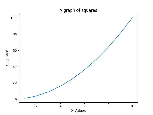
Line graphs help us do things like finding gradients, data interpolation, and linear regression (a form of predictive analysis). Here’s a very simple plot:
import matplotlib.pyplot as plt
x = [1, 2, 3, 4, 5, 6, 7, 8, 9, 10]
y = [1, 4, 9, 16, 25, 36, 49, 64, 81, 100]
plt.plot(x, y) #Plot the values in x and y on their respective axes
plt.xlabel('X Values') #label the x-axis
plt.ylabel('X Squared') #label the y-axis
plt.title('A graph of squares') #give the graph a title
plt.show()
This produces the following graph:
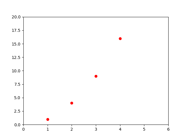
We can do more, like changing colors, and the shapes used to plot a graph. For example:
plt.plot([1, 2, 3, 4], [1, 4, 9, 16], 'ro') #'ro' means red circles
plt.axis([0, 6, 0, 20])
plt.show()
2. Histograms
Histograms are a good way to visualize the way data is distributed. Here’s an example:
import matplotlib.pyplot as plt
import numpy as np

# Fixing random state for reproducibility
np.random.seed(7) #This will help ensure we get the same random numbers

N_points = 100000
n_bins = 30 #number of distributions on the x-axis

# Generate a normal distribution, center at x=0
x = np.random.randn(N_points) #generate 100,000 random and normally distributed points
plt.hist(x, bins=n_bins) #create a histogram from our random points with 30 divisions (bins)
plt.ylabel('No of occurrences')
plt.show()
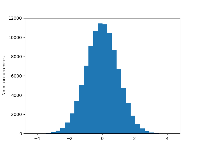
Our histogram shows us that our data is pretty well distributed under a normal curve (the bell curve). This is an example of one that has a different distribution:
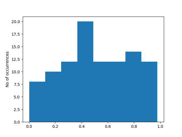
There are many types of distributions, but that is a topic that is out of the scope of this tutorial. The main point is, histograms can help you if you need to figure out the distribution of your data.
3. Scatter Plots / Scatter Diagrams
Scatter plots are used to show correlation (relationships between different types of data). Here’s an example:
import matplotlib.pyplot as plt
import numpy as np
import pandas as pd

# Create a dataset:
df=pd.DataFrame({'x': range(1,101), 'y': np.random.randn(100)*15+range(1,101) })

### NOTE: Do not be too bothered about the dataset
### We have engineered this to have a strong positive correlation

# plot
plt.plot( 'x', 'y', data=df, linestyle='none', marker='o')
plt.xlabel('humidity')
plt.ylabel('temperature')
plt.show()
This should produce a scatter plot similar to this:
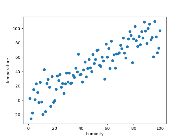
Assuming our x-axis values to be humidity, and the y-axis to be temperature, we now observe a strong positive correlation between humidity and temperature. Low humidity indicates a likelihood of low temperature, high humidity indicates a likelihood of high temperature, and vice-versa.
This might not be standard science, but you get the idea of correlation and scatter plots.
This has been a very quick introduction to Matplotlib and some of its basic functions. You can go further with this official tutorial.
KayO